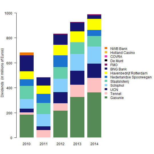
Let's use these data from Dutch Finance Minister Jeroen Dijsselbloem as an example.
For simplicity I share the 2010-2014 data in the R code below, recreating the right 5 columns of the original chart. I selected similar colors from this Chart of R Colors.Help Minister Jeroen Dijsselbloem improve his stacked bar chart! https://t.co/4oAqm87mkx pic.twitter.com/qqhjeJcdf6— Data and Data Viz (@DataAndDataViz) January 29, 2016
div <- matrix(
  c(182, 20, 30, 76, 107, 52, 64, 128, 1, 0, 0, 0, 23,
    0, 60, 30, 97, 90, 74, 65, 64, 2, 0, 0, 0, 0,
    215, 59, 90, 108, 94, 92, 86, 83, 7, 0, 0, 0, 0,
    325, 98, 112, 135, 95, 0, 87, 71, 5, 0, 0, 0, 0,
    362, 117, 113, 139, 83, 48, 89, 32, 5, 1, 0, 0, 0),
  ncol=5,
  dimnames = list(
    c("Gasunie", "Tennet", "UCN", "Schiphol", "Staatsloterij",
      "Nederlandse Spoorwegen", "Havenbedrijf Rotterdam", "BNG Bank", "FMO",
      "De Munt", "COVRA", "Holland Casino", "NWB Bank"),
    c("2010", "2011", "2012", "2013", "2014")))

orig.col <- colors()[c(518, 558, 477, 430, 11, 131, 652, 477, 459, 153, 456,
  148, 92)]

par(mar=c(4, 4, 2, 12), yaxs="i", las=1)
barplot(div, ylim=1.05*c(0, max(apply(div, 2, sum))),
  ylab="Dividends  (in millions of Euros)",
  col=orig.col, border=NA, legend.text=TRUE,
  args.legend=list(x="right", inset=-0.55, border=NA, bty="n"))
Note that the dividends reported for Havenbedrijf Rotterdam (yellow) were greater than Nederlandse Spoorwegen (midnight blue) in 2014, although this does not agree with the chart shown in the tweet above.
The three main decisions in creating a stacked bar chart are (1) the order of the columns, (2) the order of the stacks, and (3) the color of the stacks.
Order of the Columns
In this case, ordering the columns is easy, because year is ordinal. If this were not the case, you might want to order the columns by the totals, or some other metric important to the story you're telling with the chart.
Order of the Stacks
It's not clear to me how the companies (stacks) were ordered in the original chart. It's not alphabetical, and it's not the average annual dividend. What is it?
I contend that it's good practice to place the least variable stacks at the bottom of the column. That way, the ups and downs of the more variable stacks do not disrupt the pattern of the less variable stacks.
In order to place those companies with the least variable dividends on the bottom of the bar chart, I ordered the rows by their variance and removed any rows with all zero dividends.
rowvar <- apply(div, 1, var)
div2 <- div[order(rowvar), ]
div3 <- div2[apply(div2, 1, sum)>0, ]
Color of the Stacks
It's good practice to assign colors in a meaningful way whenever possible, delivering more information than simply a random collection of colors. Color could be used to identify the age, location, or product type of the companies, for example. It depends on what's important to the story you are telling with the chart.
I thought it would be interesting and informative to define colors for the companies based on whether their dividends increased or decreased over time, on average. So, I calculated the average annual change in dividends and assigned ordered positive changes to the "YlOrRd" (yellow-orange-red) color set using the R package RColorBrewer and ordered negative changes to the "Blues".
library(RColorBrewer)
change <- apply(div3, 1, function(y) lsfit(1:dim(div3)[2], y)$coef[2])
new.col <- rep(NA, length(change))
sel <- change > 0
new.col[sel] <- brewer.pal(sum(sel), name="YlOrRd")[rank(change[sel],
  ties.method="first")]
new.col[!sel] <- brewer.pal(sum(!sel), name="Blues")[rank(-change[!sel],
  ties.method="first")]

par(mar=c(4, 4, 2, 12), yaxs="i", las=1)
barplot(div3, ylim=1.05*c(0, max(apply(div3, 2, sum))),
  xlab="Year", ylab="Dividends  (in millions of Euros)",
  main="Companies Partially Owned by the Netherlands",
  col=new.col, border=NA, legend.text=TRUE,
  args.legend=list(x="right", inset=-0.55, border=NA, bty="n"))
Reflections
What a difference it makes to have the company with the most variable dividends, Gasunie, at the top of the stack rather than at the bottom. It makes it much easier to see that the dividends of the other companies were relatively consistent during 2010-2014.
And using color to identify which companies had increasing and decreasing dividends is also very informative. It makes it easy to see that the dividends of Gasunie increased more and those of BNG Bank declined more than the other companies during 2010-2014.


Nice!
ReplyDelete